🌟 Freemium Demo
💻 GitHub SourceCode
🏅 Premium Version
📚 Documentation
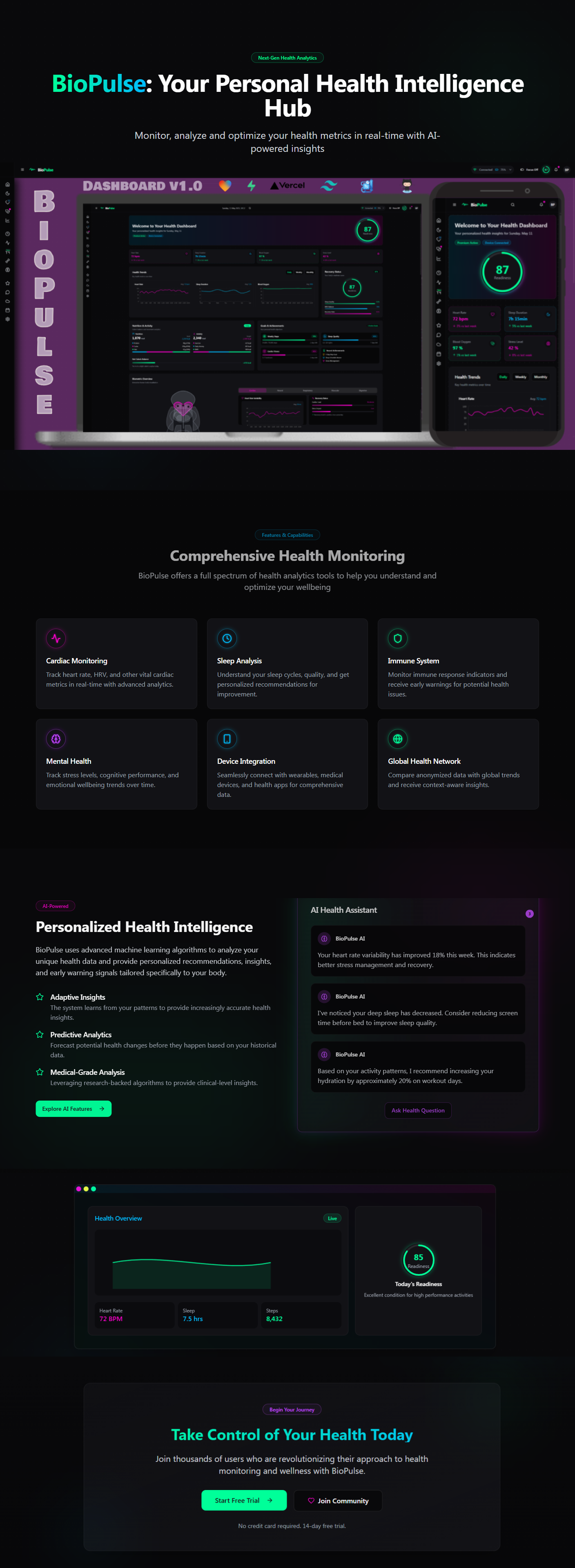
BioPulse Dashboard
Your AI-Driven Health Hub for Wearables.
🔬 What is BioPulse Insight Hub?
BioPulse Insight Hub is an innovative Freemium Dashboard Template platform designed to streamline the complexities of biotech. Leveraging advanced AI technologies, it delivers concise and accurate summaries of clinical trial data, real-time news alerts, and insightful market impact analyses. Tailored specifically for retail investors, it empowers users to navigate the dynamic biotech sector with confidence and informed decision-making.
🛠️⚙️ Technical Stack
- Lovable ❤️: Delivers an engaging and user-friendly interface, prioritizing exceptional user experience.
- TypeScript 📜: Ensures robust, type-safe development, enhancing scalability and maintainability.
- Next.js ⚡️: Offers fast, SEO-optimized performance through server-side rendering and static site generation.
- Vercel 🚀: Streamlines deployment, providing scalable and reliable hosting.
- Tailwind CSS 🎨: Employs a utility-first approach for rapid and responsive design with a modern aesthetic.
- HTML 🖥️: Maintains semantic structure, promoting accessibility and cross-browser compatibility.
- Supabase ☁️: Utilizes a real-time, open-source PostgreSQL database for effective data management, including health metrics and user profiles.
🧠 Key Features
- AI-Driven Summaries: Transforms intricate clinical trial data into clear, easy-to-understand insights, facilitating quick comprehension and analysis.
- Real-Time Alerts: Provides instant updates on critical biotech news and developments, keeping users consistently informed.
- Market Impact Analysis: Assesses how clinical advancements may influence market trends, supporting strategic investment decisions.
- Intuitive User Interface: Designed for effortless navigation, allowing users to access and interpret key information efficiently.
🌍 Target Audience
- Retail Investors: Seeking to make data-driven decisions in biotech investment.
- Financial Analysts: Looking for structured access to biotech data for comprehensive market analysis.
- Healthcare Enthusiasts: Interested in the latest clinical trials and biotechnological advancements.
🚀 Why Choose BioPulse Insight Hub?
BioPulse Insight Hub distinguishes itself through its comprehensive suite of analytical tools, combining real-time data processing with AI-driven insights. This unique blend empowers users to stay ahead of market shifts, offering unparalleled support for strategic decision-making.
💓 BioPulse Roadmap
✅ Completed (May 2025)
- Dashboard: Intuitive layout featuring a dynamic header, sidebar, and real-time health metrics (heart rate, sleep quality, SpO2).
- Core Features: AI insights, data export functionality, and collaborative team mode.
🔮 Upcoming (2025-2026)
- Q3 2025: Enhanced AI capabilities, wearable device integration, and IoT compatibility.
- Q4 2025: Mobile application launch and augmented reality data visualization.
- 2026: Multilingual support, enterprise solutions, and immersive VR coaching.
Features
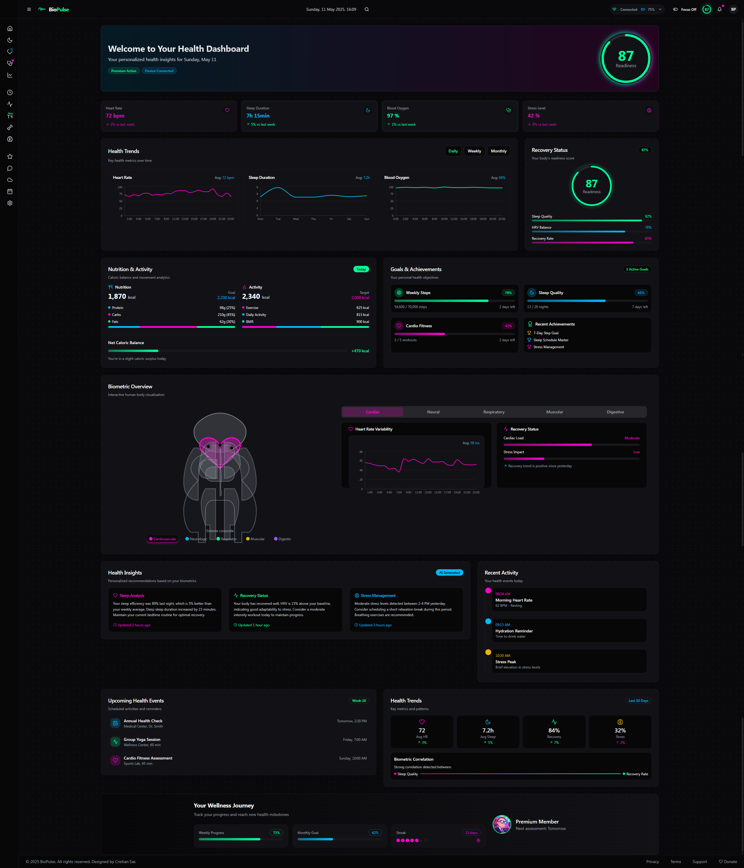
General Dashboard Structure 🌐
- Header: Top bar with essential info and quick navigation. 🧠
- Sidebar (left): Vertical menu for fast access to sections and settings. ⚙️
- Body (main area): Central space for data, charts, and analytics, split into flexible modules. 📊
- Footer (optional): Extra info or shortcuts (e.g., data export). 📥
1. Header 🎨
The header stays minimalist but becomes a premium control hub with a sleek, high-tech vibe. 😎
Existing Elements (Upgraded):
- Logo/App Name: “BioPulse” with a stylized logo (a pulsing line synced to live heart rate if available 💓). Hover reveals a tagline like “Your Health, Amplified” ✨.
- Date & Time: “Monday, April 7, 2025, 14:35” ⏰ – click to tweak time zone or set time-based alerts (e.g., “Remind me to chill at 6 PM” 🔔).
- Health Score: Animated circle “Readiness Score: 87/100” 🌈 with a color gradient (green = good 🟢, yellow = meh 🟡, red = uh-oh 🔴). Hover for a breakdown (e.g., “Sleep: 60%, HRV: 20%” 📈).
- User Button: Profile icon 👤 (top right) with dropdown for settings, logout, export (PDF/CSV/JSON 📑), plus a new “Switch Profile” for family or medical teams 👨👩👧.
- Quick Search: Tiny search bar 🔍 with AI-powered autocomplete (e.g., type “sleep” and get “Sleep April 3” or “Weekly Sleep Avg” 💡).
- Notifications: Bell icon 🔔 with badge (e.g., “2”) and a dropdown mini-feed (e.g., “SpO2 dropped to 88% at 3:15 AM” + “See Details” button 🔎).
New Elements:
- Connectivity Indicator: Device icon ⌚ showing status (“Connected” / “Disconnected”) and battery level (e.g., “75%” 🔋).
- Focus Mode Toggle: Small button (“Focus Mode” 👁️) to hide notifications and simplify the UI for deep dives.
- Quick Commands: Mini-icons (e.g., “+” to add a widget 🛠️, “play” to start a 24h data animation ▶️).
Design:
- Background: Dynamic gradient shifting with the time of day (dark gray at night 🌙, bluish-gray in the morning 🌞).
- Effects: Glassmorphism with subtle blur and light reflections on interaction (e.g., Readiness Score “glows” on click ✨).
- Accents: Neon vibes – customizable (green #00FF99 🟢, blue #00CCFF 🔵, or purple #CC00FF 🟣).
2. Sidebar (Left) 🚪
The sidebar turns into an intuitive, customizable navigation center with a premium edge. 🌟
Existing Elements (Enhanced):
- Main Panel: “Dashboard” with a “home” icon 🏠 – click to reset the layout to default.
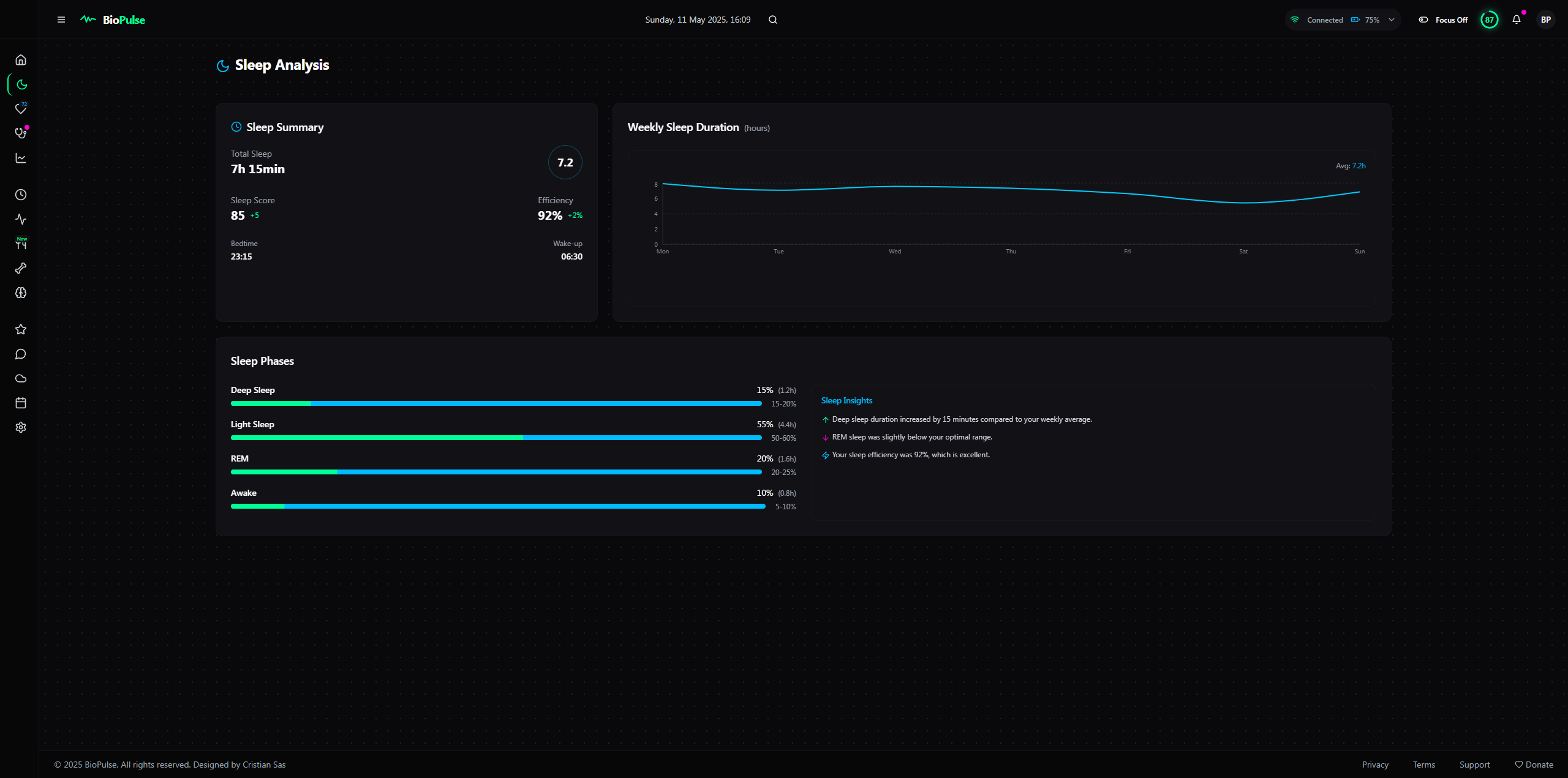
- Sleep Section: “Sleep” 🌙 with a hover dropdown (e.g., “Phases”, “Quality”, “History” 📅).
- Cardiac Section: “Cardiac” 💓 – now shows a live badge (e.g., “72 bpm”) even when collapsed.
- Breathing Section: “Breathing” 🫁 – adds a visual alert (e.g., tiny red circle 🔴 if SpO2 dips below threshold).
- Advanced Analytics: “Insights” 📊 – expanded with “Predictions” and “AI Correlations” 🔮.
- Settings: “Settings” ⚙️ – now includes “Visual Themes”, “API Integrations”, and “Data Backup” 💾.
- History: “Calendar” 📆 – quick filter on hover (e.g., “Last 7 Days” ⏳).
New Elements:
- Favorites: Custom section to pin fave modules (e.g., “REM Sleep” or “Daily HRV” ⭐).
- AI Assistant: Chat icon 💬 opens a mini-bot (e.g., “What’s low HRV?” or “Analyze my sleep” 🤖).
- Sync Status: Cloud icon ☁️ to check sync with other devices/apps (e.g., Apple Health, Fitbit 🌐).
Design:
- Width: 250px expanded, 60px collapsed – smooth “unfold” animation 🎬.
- Background: Matte black with a subtle texture (think carbon fiber 🖤) for a high-tech feel.
- Interactivity: Icons pulse on hover 💓, and the active item gets a thin neon outline that “breathes” 🌬️.
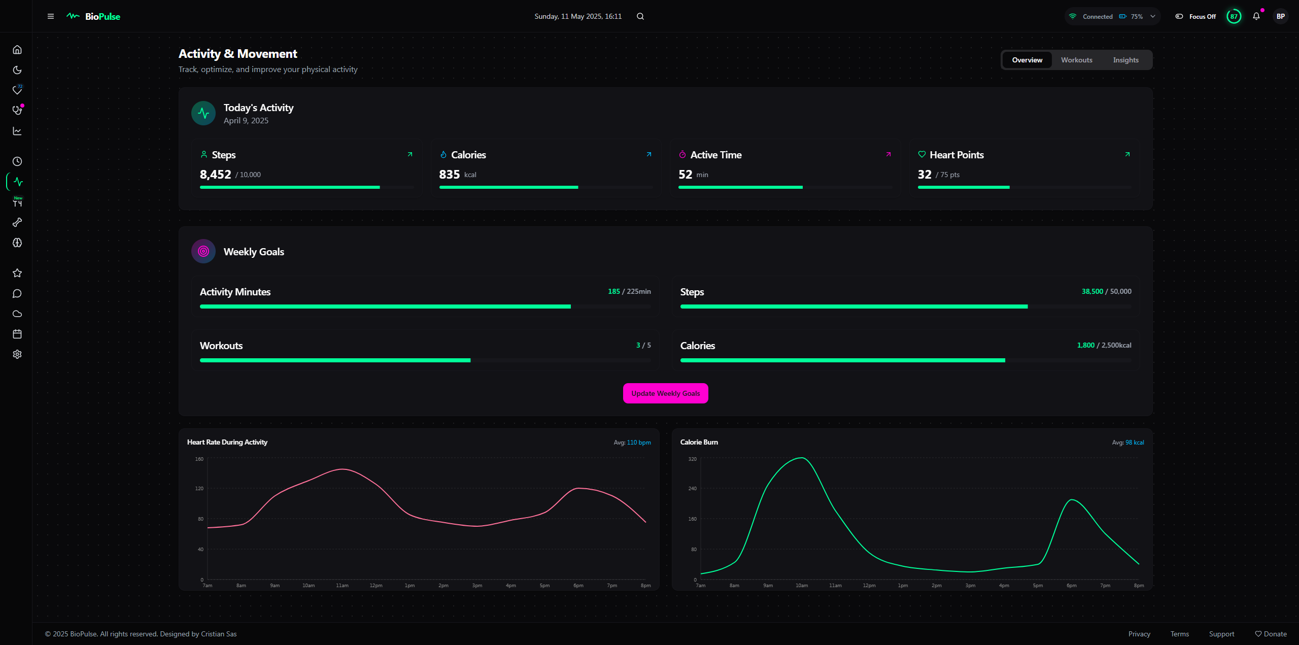
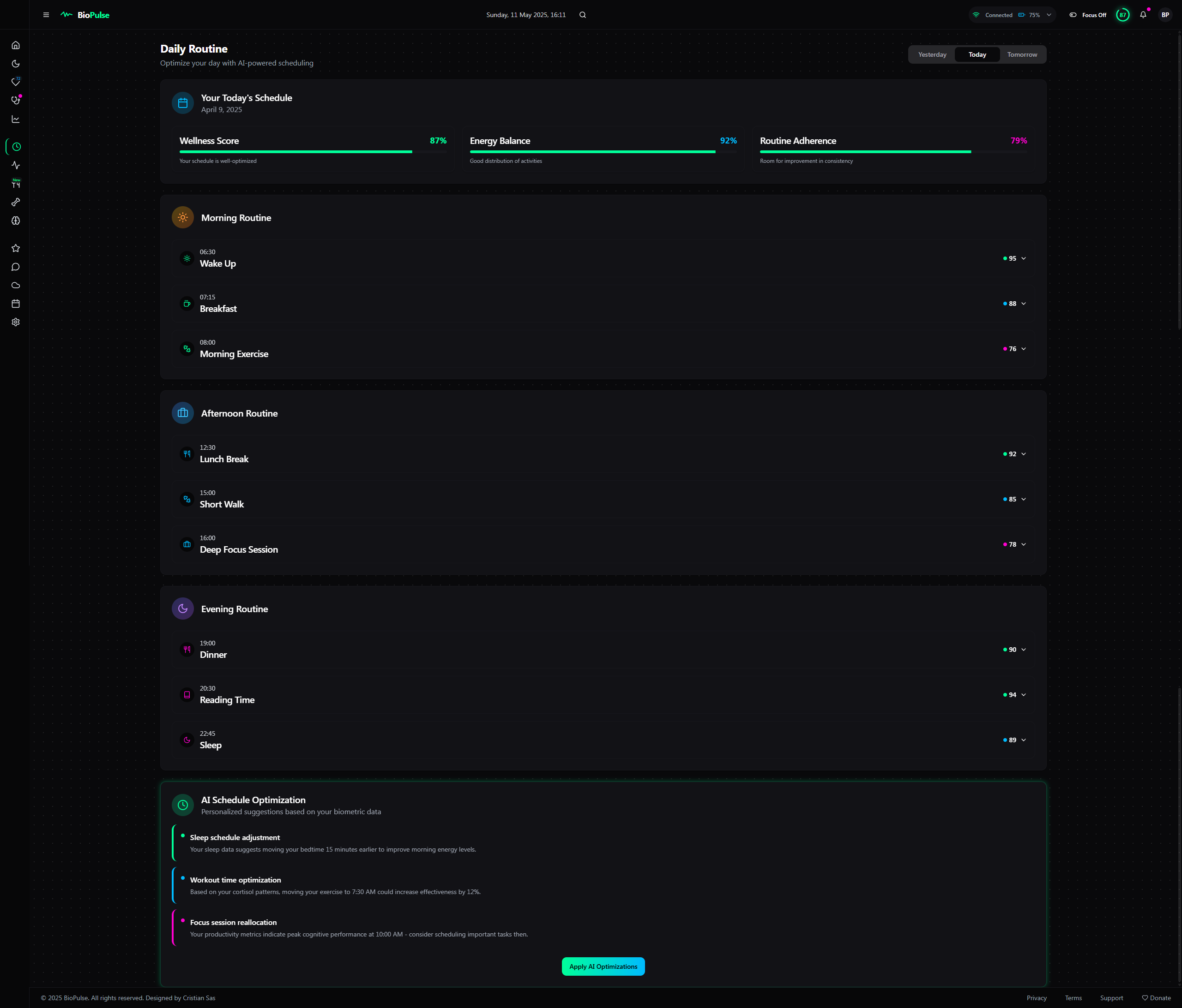
3. Body (Main Area) 📋
The central zone becomes ultra-flexible, with dynamic modules that adapt to your needs and deliver deep insights. 🚀
Main Panel (Enhanced):
- Health Score: Big circle 🌍 with “Drill Down” option – click to see factor breakdown (e.g., “Sleep: +40, HRV: +30” 🔍).
- Quick Charts:
- Heart Rate: Overlay with effort zones (e.g., “Rest”, “Activity” ❤️).
- Sleep Duration: Comparison to weekly avg (e.g., “+15min above avg” ⏱️).
- Oxygen Level: Small circle with daily trend (e.g., “-1%” arrow 📉).
- Live Widget: “Live Data” 📡 – adds a mini-EKG animation and a “Record” button to save snippets 🎥.
Sleep Section (Upgraded):
- Timeline Chart: Zoom-in feature for 30min segments 🔎 and overlay with room temp (if available 🌡️).
- Stats: Adds “Sleep Debt” (e.g., “-2h from optimal” 😴) and a prediction (e.g., “Today: 85% efficiency” 🔮).
- Correlations: Mini-chart for light or noise impact (e.g., “Noise: +5 wake-ups” 🎙️).
Cardiac Section (Upgraded):
- Live Heart Rate: Big “72 bpm” with classification (e.g., “Normal” ✅) and “Compare” to monthly avg.
- History: Zoomable chart with filters (e.g., “Night Only” 🌙 or “Activity Only” 🏃).
- HRV: Daily score + heatmap over 30 days to spot good/bad days 🌈.
Breathing Section (Upgraded):
- Breathing Rate: Avg per sleep phase (e.g., “REM: 16/min” 🫁).
- SpO2: Percentage circle + subtle sound alert (optional 🎶) for drops below 90%.
- Details: Table with altitude/humidity correlations (if data exists 🌍).
Advanced Analytics (Enhanced):
- Correlations: Interactive scatter chart – add variables (e.g., “Caffeine vs. Sleep” ☕).
- Trends: 30-day line with AI projection (e.g., “HRV up 10ms in 2 weeks if you keep this up” 📈).
- Recommendations: Gamified card (e.g., “Sleep 8h for 3 days to earn a badge” 🏆).
New Elements:
- AI Predictive Module: Card guessing your next state (e.g., “Tomorrow: Readiness 82% if you sleep 7h” 🔮).
- Health Map: 3D body widget highlighting areas (e.g., red heart if HRV’s low ❤️).
- Quick Journal: Small card to log external factors (e.g., “Had coffee at 4 PM” ✍️).
Design:
- Background: Dark gray with a “depth” effect (3D shadows under cards 🕶️).
- Colors: Expanded palette – yellow neon (#FFFF99 🟡) for positive trends, purple (#CC00FF 🟣) for predictions.
- Interactivity: Cards “float” on hover 🪂 and expand smoothly on click 🎉.
4. Premium Features 🌟
- Advanced Customization: Save multiple layouts (e.g., “Sleep Mode” or “Performance Mode” 🎨) and animated themes (e.g., “Cyberpunk” with pulsing neon 🌌).
- External Integrations: Link to IoT sensors (e.g., room thermometer 🌡️) and apps (e.g., Strava, MyFitnessPal 🏋️).
- Multi-User: “Team Mode” for monitoring family or patients 👨👩👧👦.
- Augmented Reality: Project charts in AR if your device supports it 🕶️.
- Auto-Report: Monthly PDF emailed with a health summary 📧.
Instructions
🚀 Welcome to the AI, VibeCode Era! 🌟
BioPulse is super easy to customize and tweak with Lovable, Cursor, VS Code, and Windsurf.
Building your dream app, website, or dashboard is now 100x EASIER! 😎
No tech skills? No coding knowledge? NO PROBLEM! 🙌
With Natural Language Processing (NLP), you can create your startup by simply describing your idea. 🗣️💻
Why Go Solo? 💡
- Save BIG: Stop spending thousands or tens of thousands of euros on designers or programmers. 💸
- No Teams Needed: Forget hiring expensive crews—AI lets you do it all! 👩💻👨💻
- Fast & Simple: In 2025, AI tools make launching your vision a breeze. ⚡️
Go Viral in 2025! 🎉
Turn your idea into reality with AI, build it solo, and keep your cash! 💰
Join the #AIRevolution and create your masterpiece today! 🌍
🚀 Unleash your creativity!